
Corporate website for the engineering company Regata
Ventilation and air-conditioning equipment


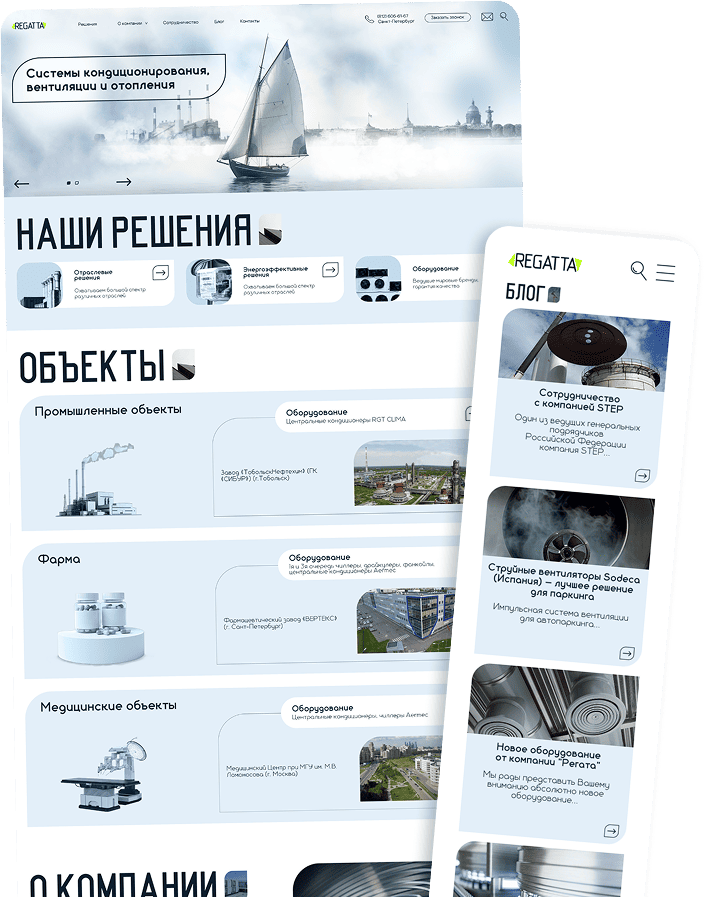
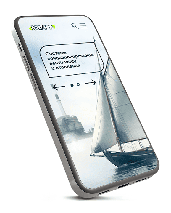
Redesign and re-engineering of the RGT AIR corporate site with a focus on commercial performance and product solutions
The client is RGT AIR, a manufacturer of energy-efficient climate solutions.

The company asked to modernize an outdated website rgt-air.ru, which no longer matched current business goals:

Presentations of technology solutions

Showcasing completed sites

B2B lead generation
Main goal
Create a modern, fast, transparent product that strengthens reputation and brings converting traffic.
What we proposed and delivered

We fully re-designed the structure

We built a new UX

We reworked navigation and built commercially oriented transition scenarios
Main focus
Not just a showcase site, but a product catalog of solutions and sites with strict transition logic, filters and a clear presentation of the company's expertise.

Technically we chose WordPress as the CMS that best fits content management, easy extension and fast publishing of changes.
Implemented

A new information-architecture frame

A single UI kit in the corporate style

A flexible card system: solutions → equipment → sites

Block content editor with no page-builder dependency

A quick-request form and map integration
Project in figures
See the updated site
via the link: https://rgt-air.ru

Description of product delivery stages
Analytics and audit of the old site
Forming UX architecture and prototypes
UI concept and design system
Responsive frontend development
Backend on WordPress with custom CPT and ACF
Integrations: Yandex Maps, request forms, filter system
Testing: functional, responsive, load
Release, domain move, final optimization
Analytics
 Full audit of the old site: structure, errors, transition map, page depthUser behavior analysis: typical entry scenarios and goalsCompetitor research in HVAC and engineering solutions
Why this approach?

The site is not just a corporate block, but a presentation of services, products and completed sites. The old version's problem was fragmented information, weak UX and an outdated resource. That required a hard data rebuild and new logic.
How we worked
Value received

Understanding the real user journey

Finding weak spots in how information is presented

Forming the frame of the future functional structure
Prototype
We created prototypes of every key section:
Industry solutionsEnergy-efficient technologiesEquipment catalogSite catalog (portfolio) with filtersBlogContacts with a map and a formCorporate pages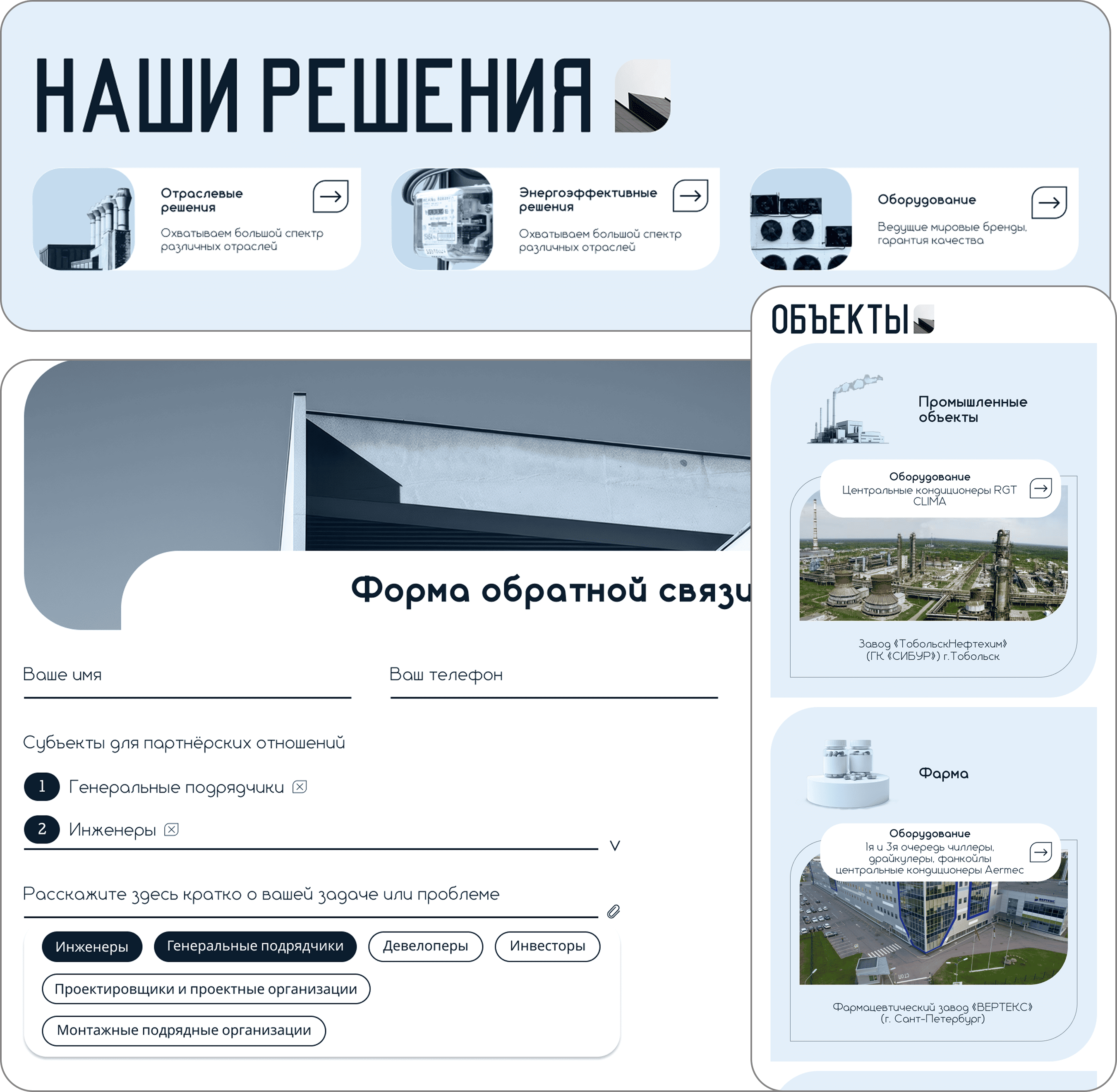
The main task of the prototypes
Keep information consistent and reduce cognitive load.
Design
Concept. A clean technical visual line: clear grids, strict spacing, minimal decoration, emphasis on visuals of the sites.
Key elements
Color palette based on the company's corporate identity
Unified 12-column modular grid
Responsive typography
UI component library
Features delivered

Accent solution cards
Clean technical blocks

Unified site pages with a photo gallery
Development
Frontend


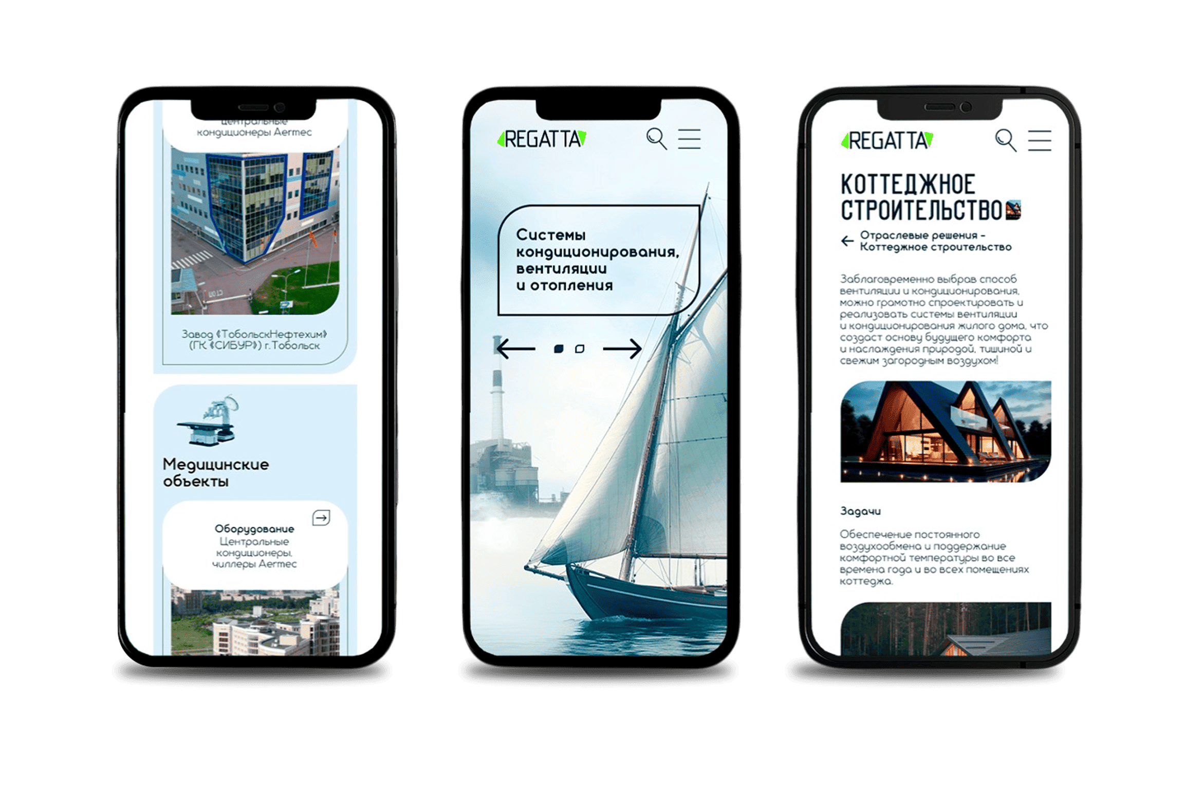
Responsive layout (mobile-first)
Speed optimization (minification, lazy-load)
Clean layout without page builders, on a component approach
Backend (WordPress)

ACF Pro for all data structures
Separate post types for solutions, sites and equipment
SEO base in place: meta tags, OpenGraph, microdata
Full content control with no developer involved
Why this stack?
The client needed a flexible site that content managers can maintain without developers. WordPress fits projects with regular catalog, news and site updates.
Integrations

Yandex Maps in contacts

Request form sent to corporate email

Image optimization tools
There were no complex external APIs - the project is fully local, with the emphasis on UX and optimization.
Testing

Functional testing of every form and transition
Responsive testing across 11 key breakpoints
Cross-browser check (Chrome, Safari, Firefox, Edge)
Load testing of catalog pages
Check that pages are available to SEO bots
Difficulties and solutions
High variation in site cards → risk of content mismatch.
We introduced a strict ACF field set and standardized the cards
Release
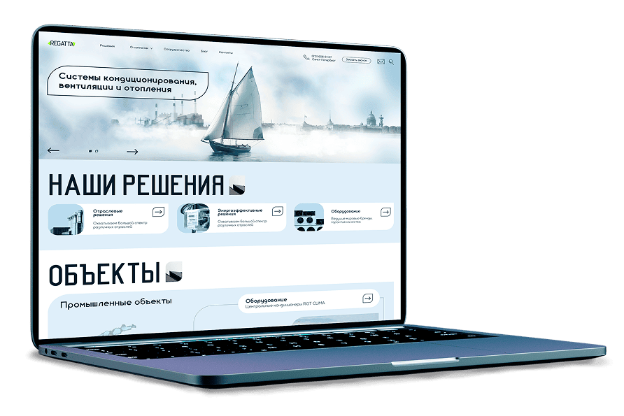
Moved the domain and updated DNS
Moved the project to new hosting
We ran final optimization before launch
We handed over a full set of rights, access and documentation
The release went without remarks, and the site indexed correctly
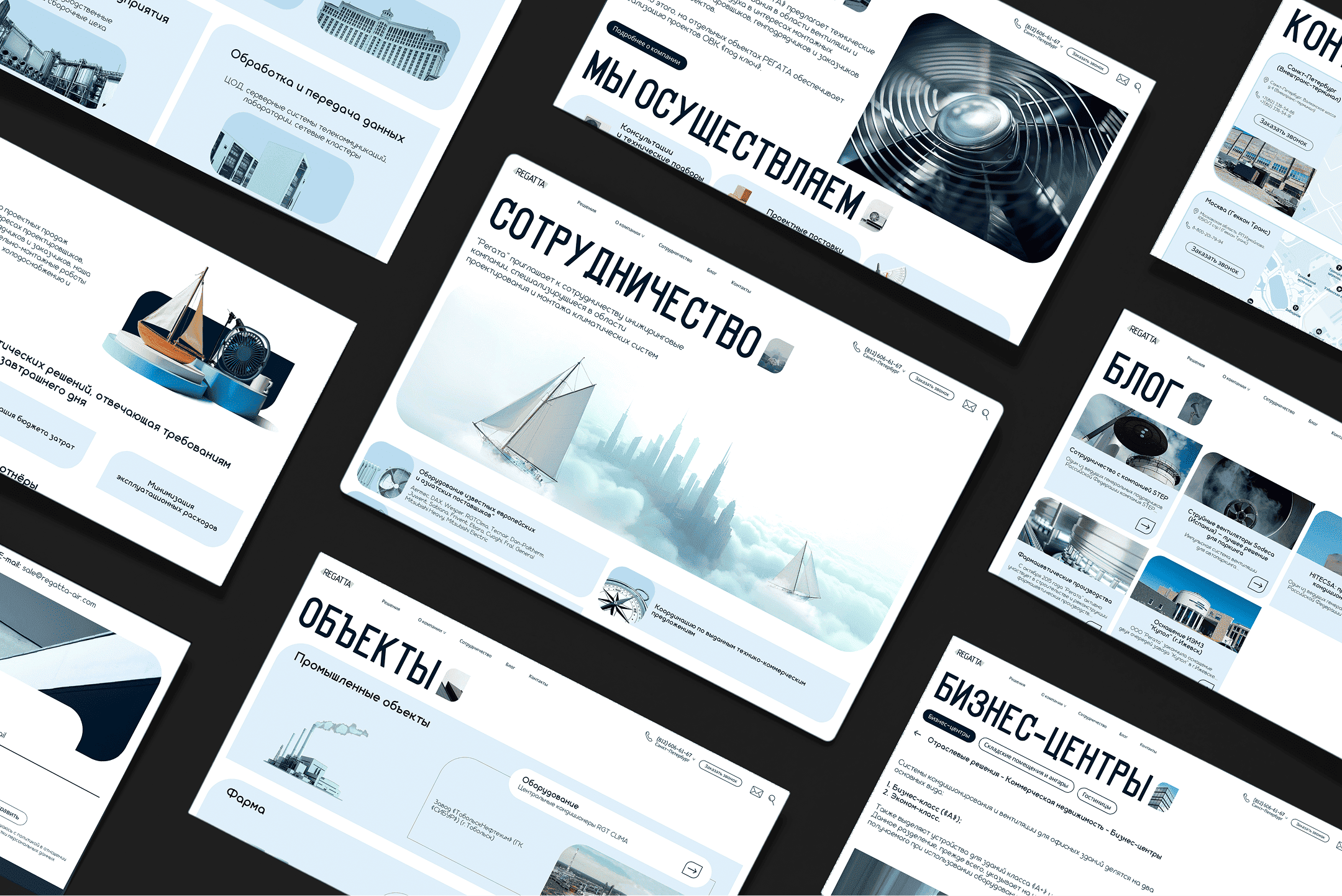
Result of our work
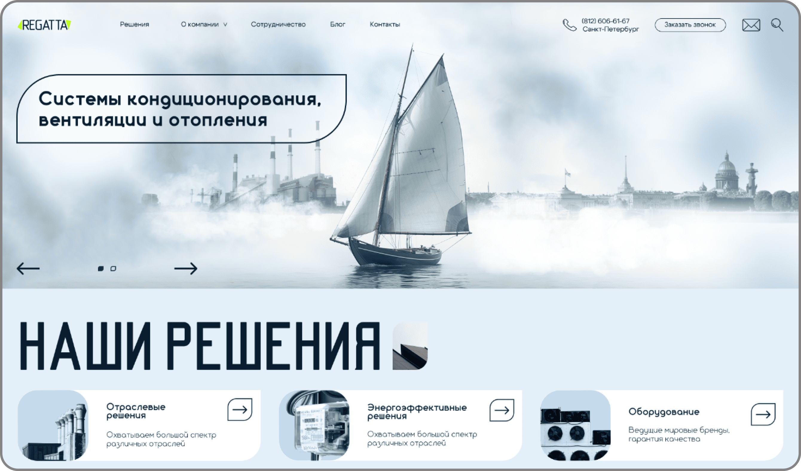
First screen of the home page
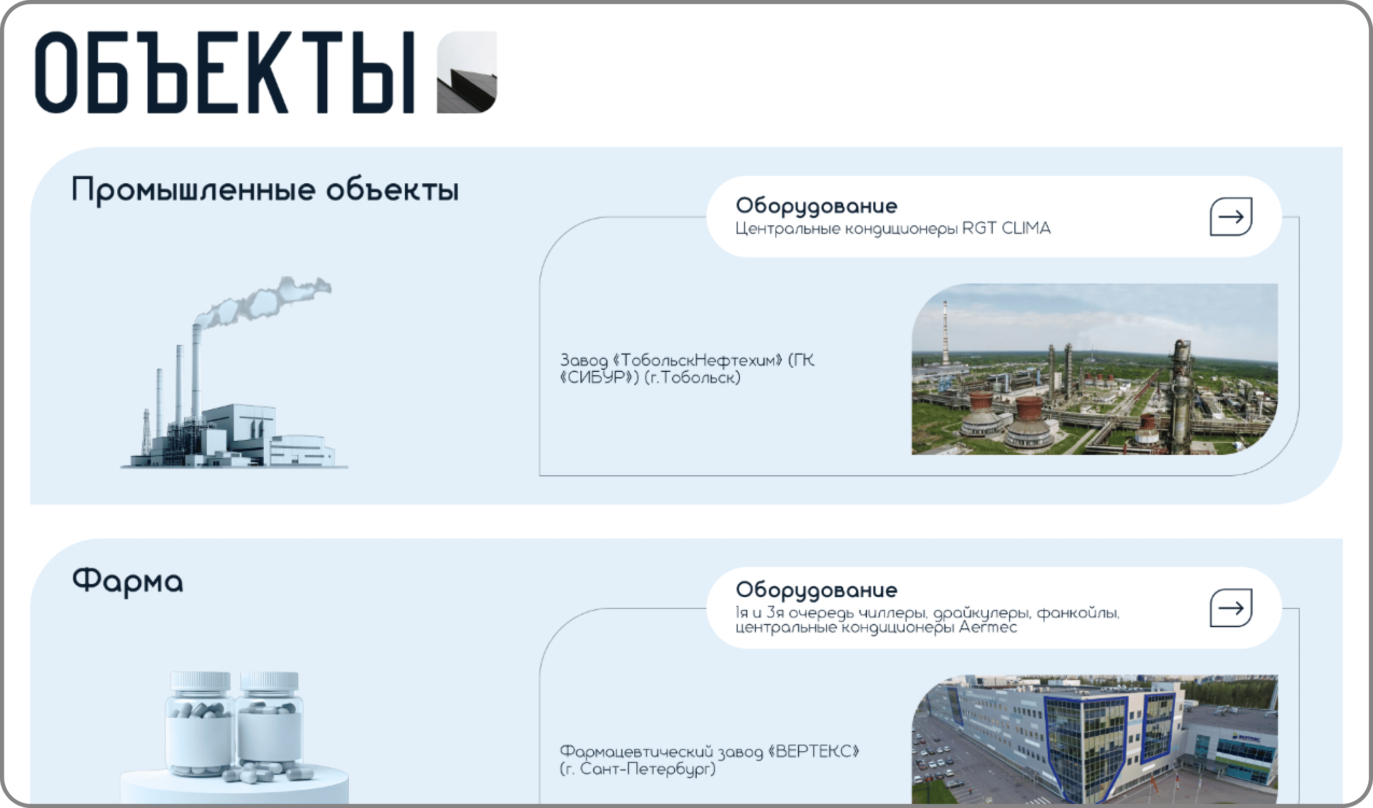
Sites section
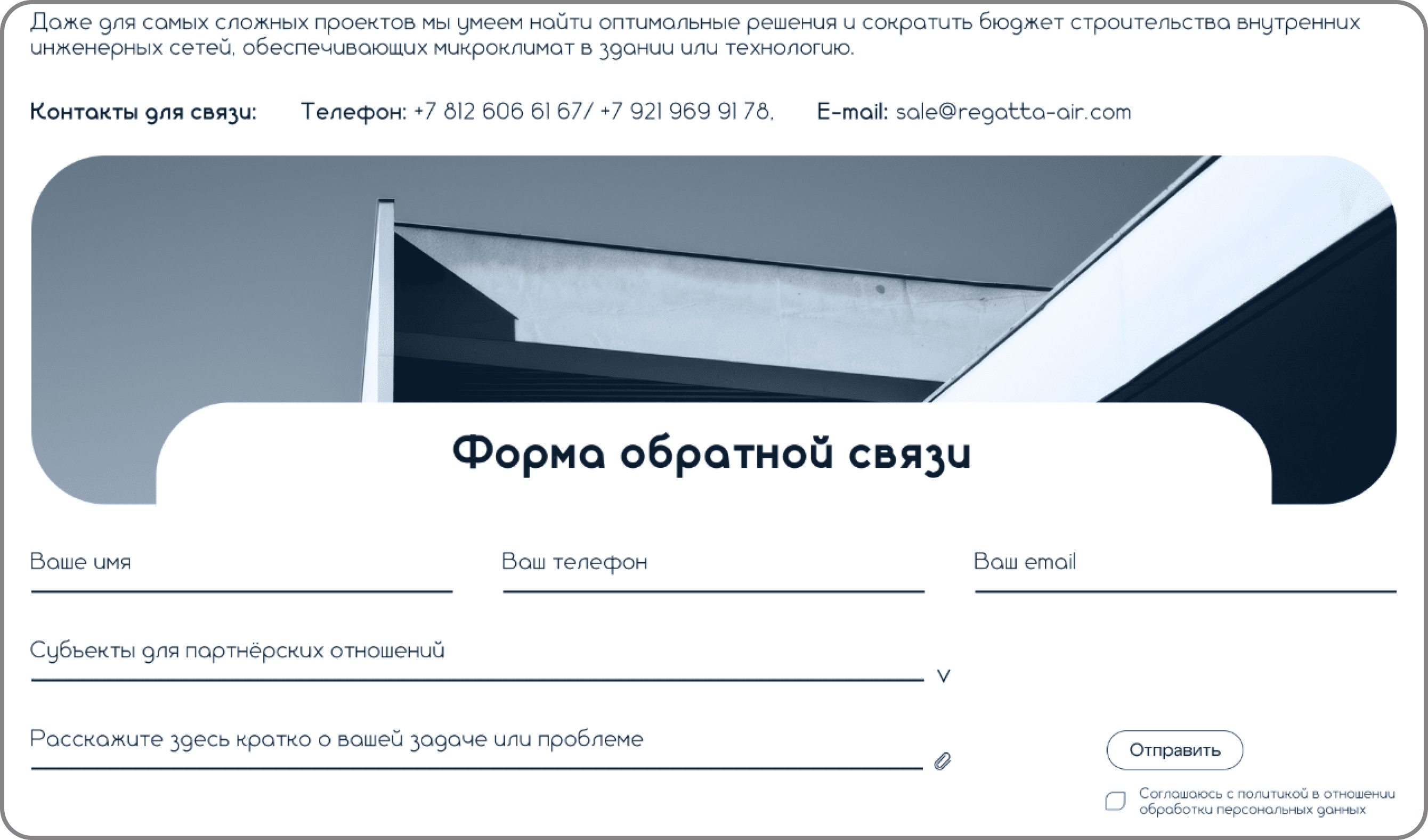
Feedback form

About the company page
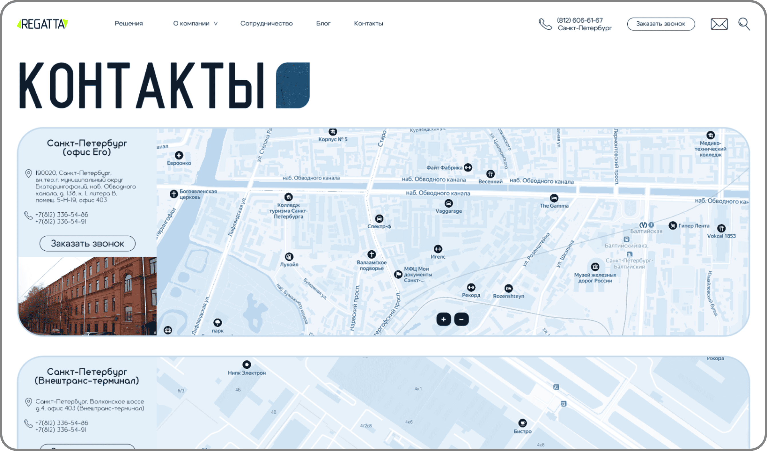
Contacts page with 3 maps
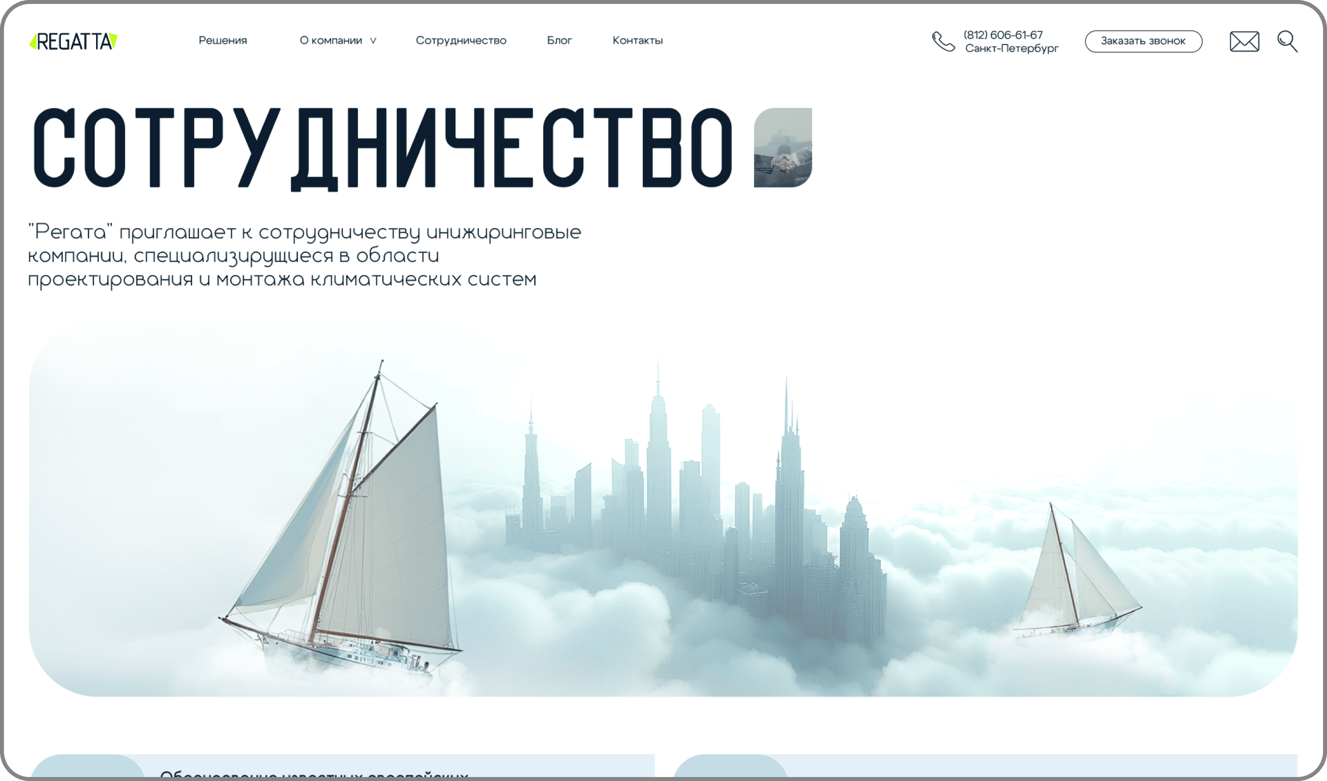
Partnership page
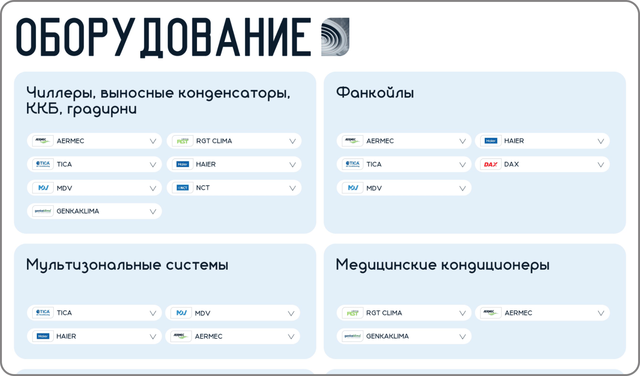
Equipment page

News article layout example
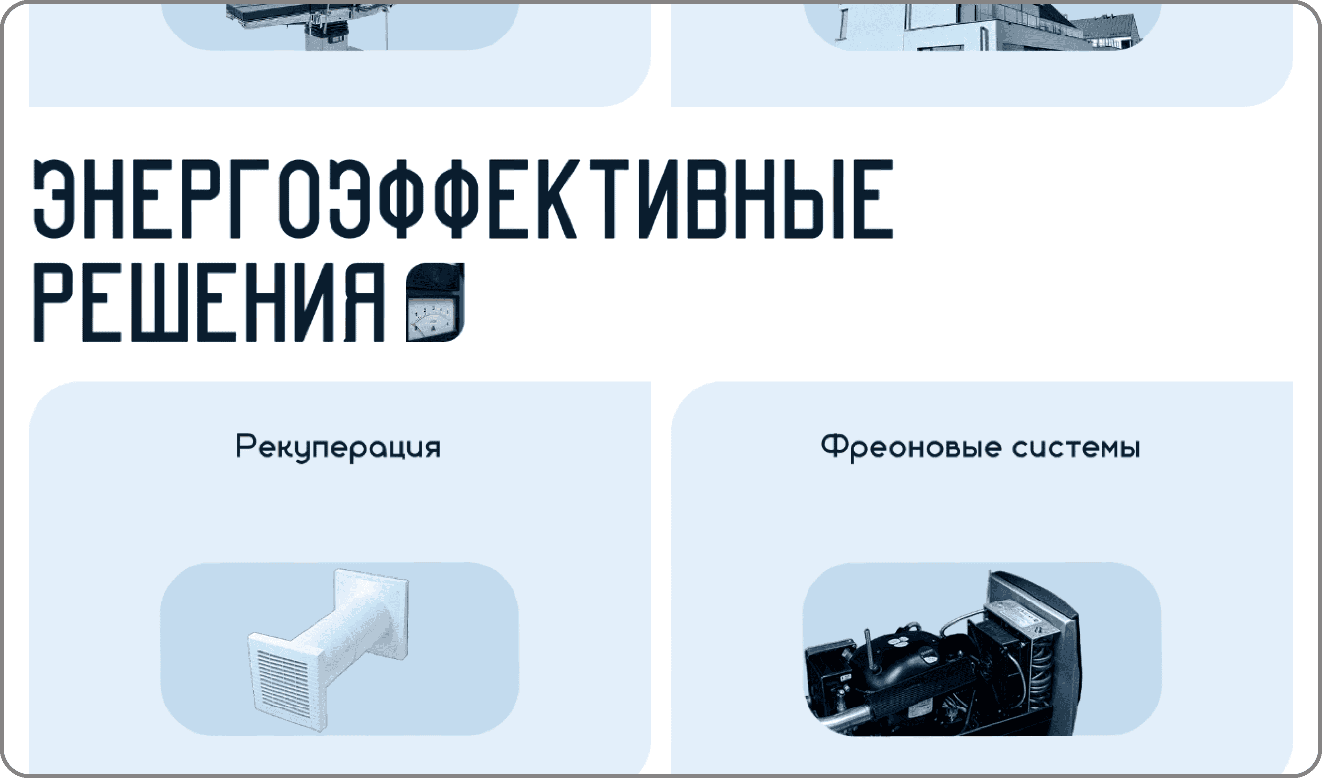
Industry and energy-efficient solutions page

First screen of the home page

About the company page
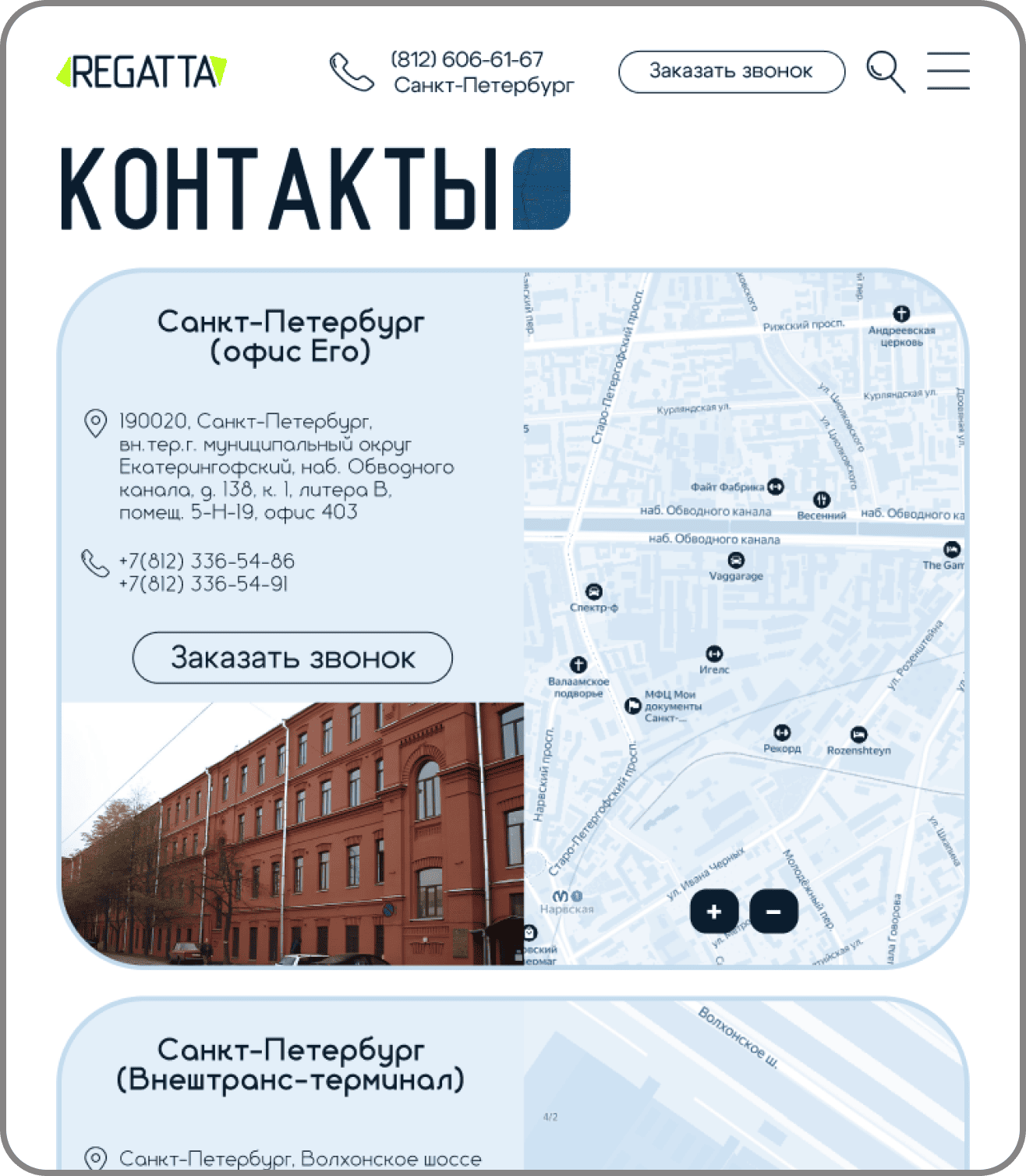
Contacts page

Partnership page
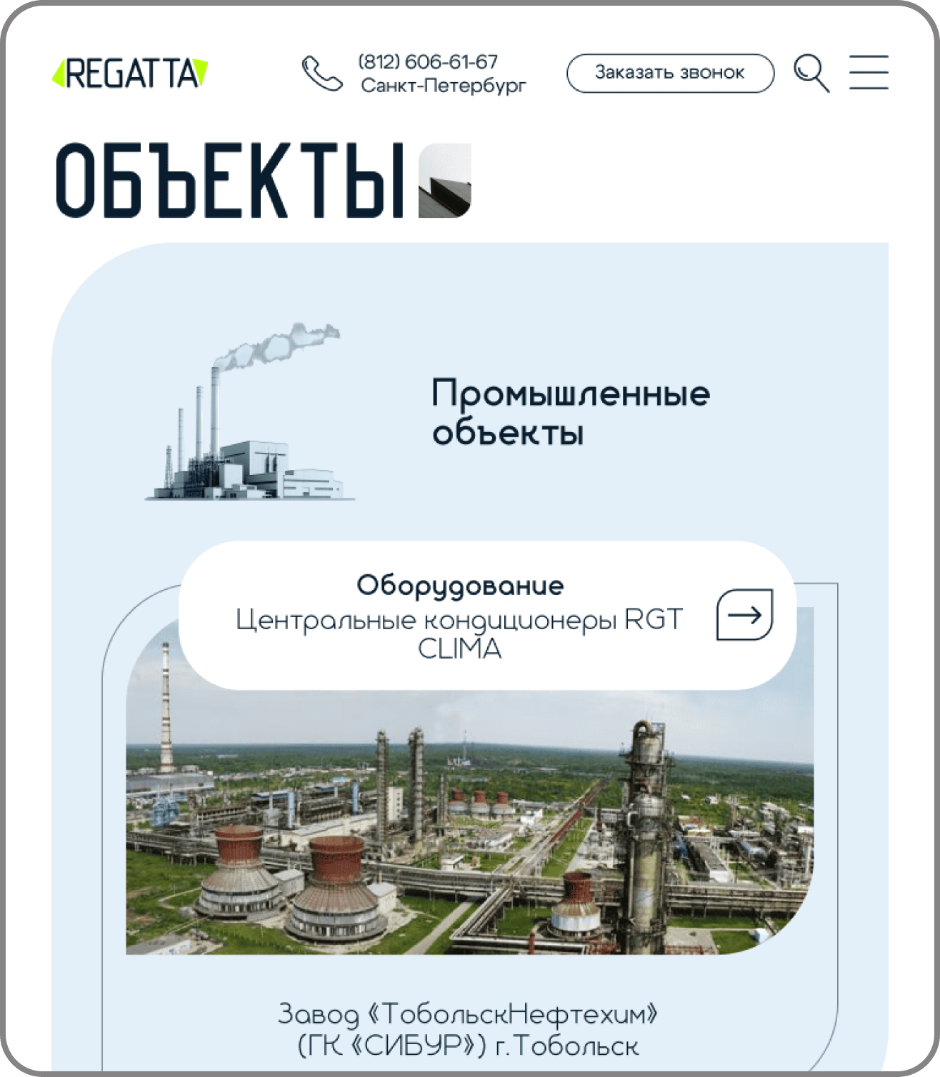
Sites section
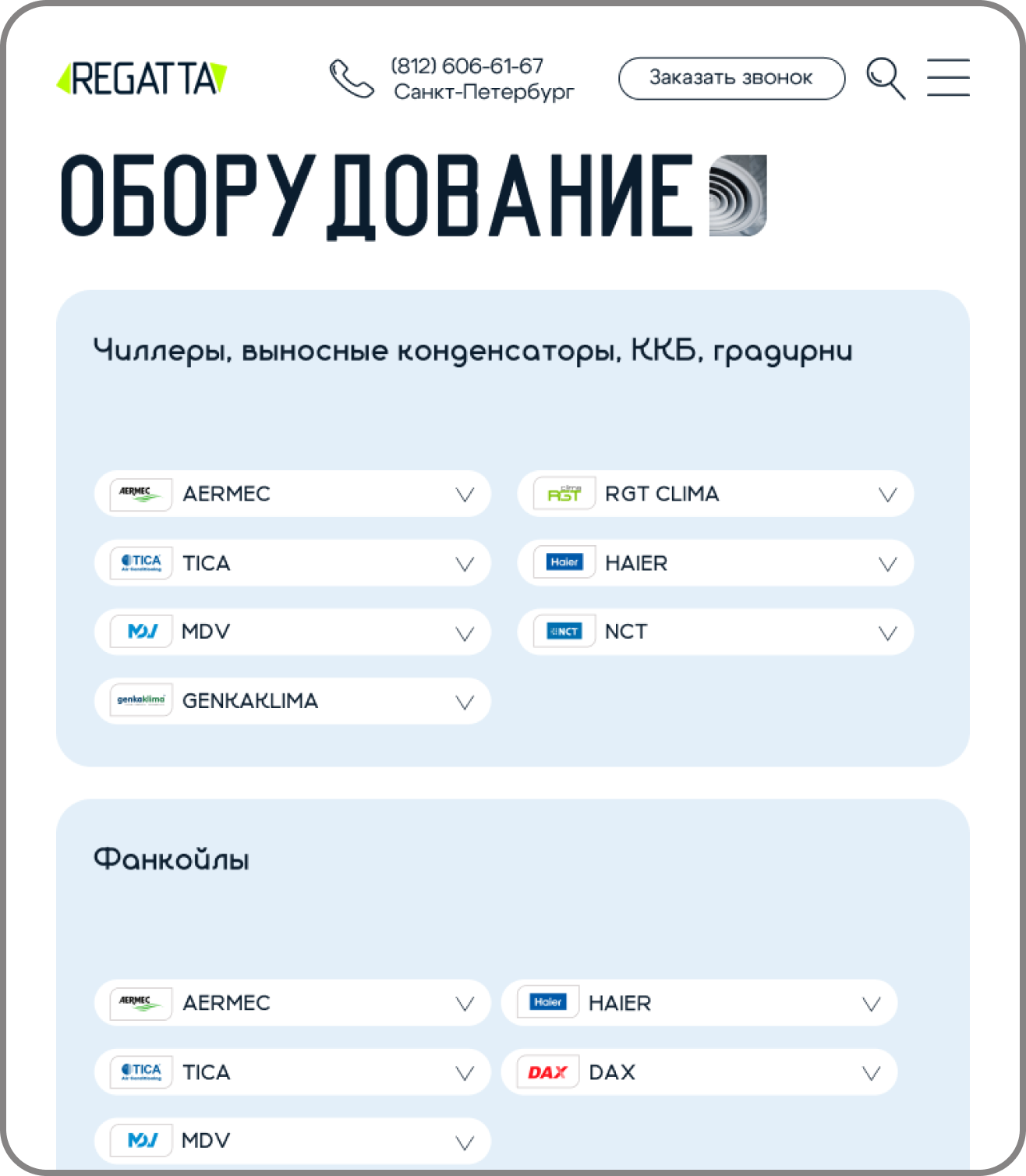
Equipment page
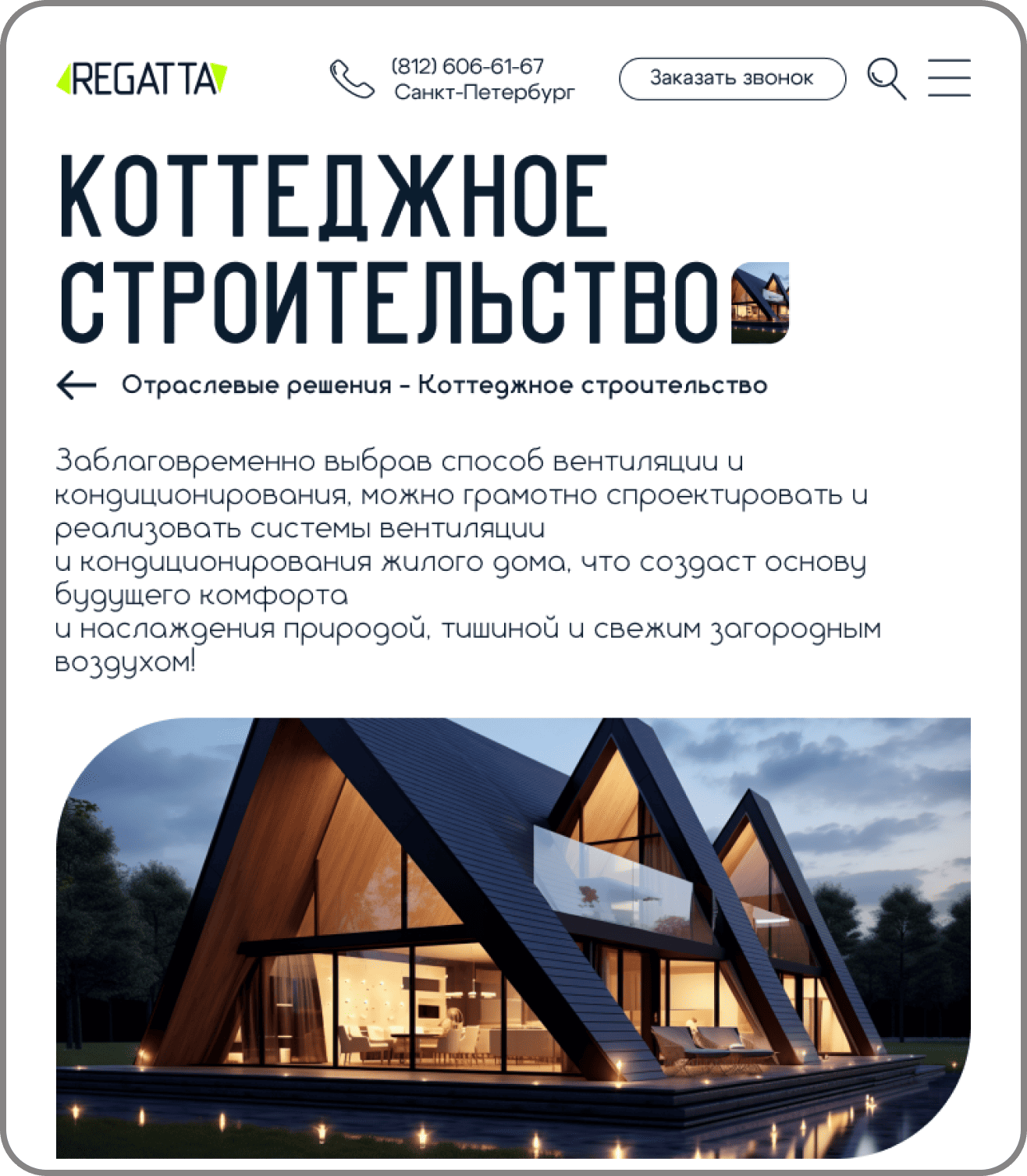
Article from the Industry solutions section
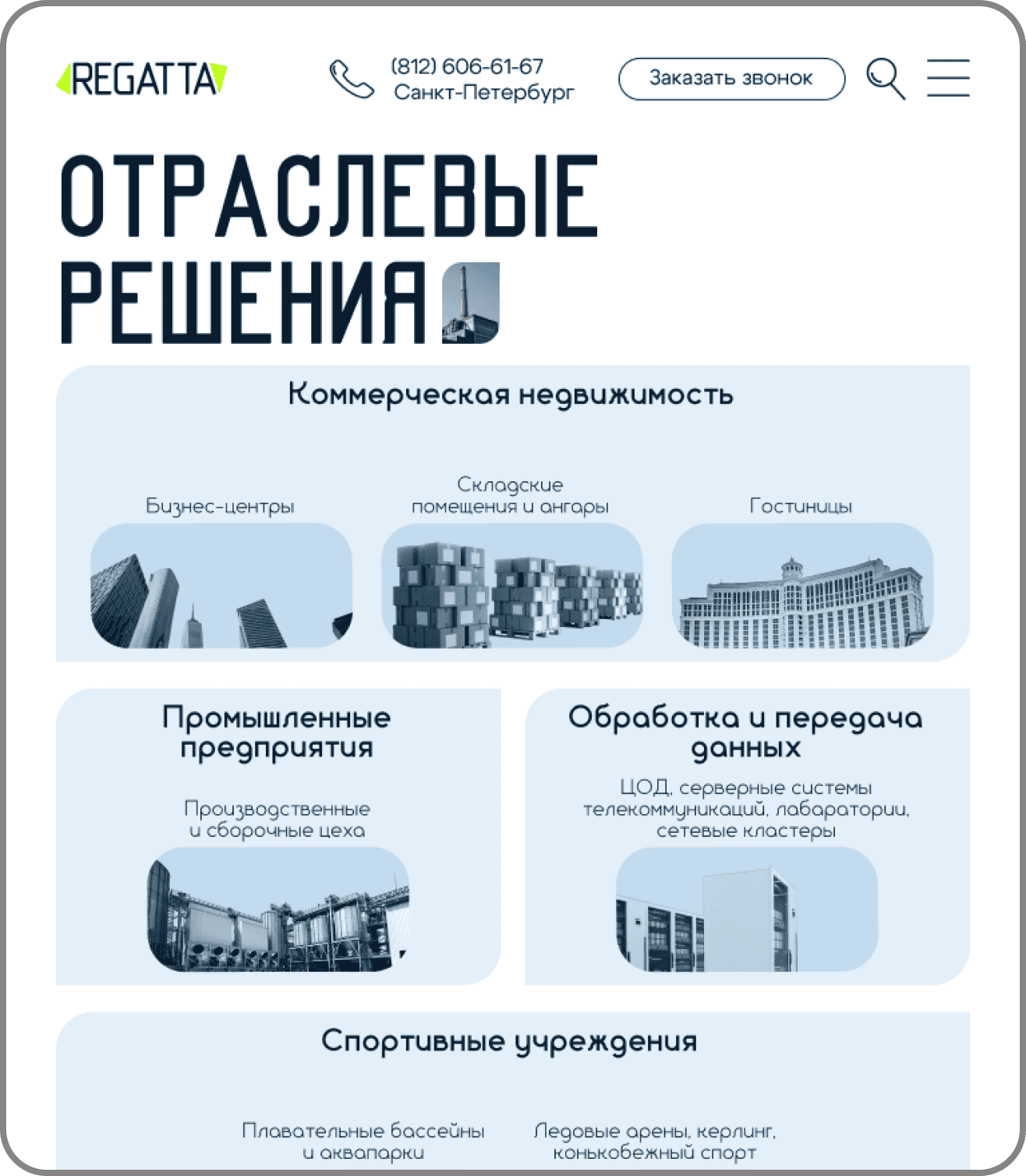
Industry solutions subsection
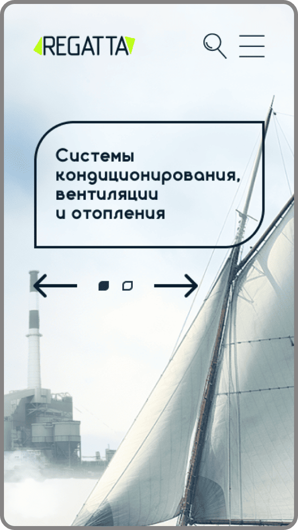
First screen of the home page
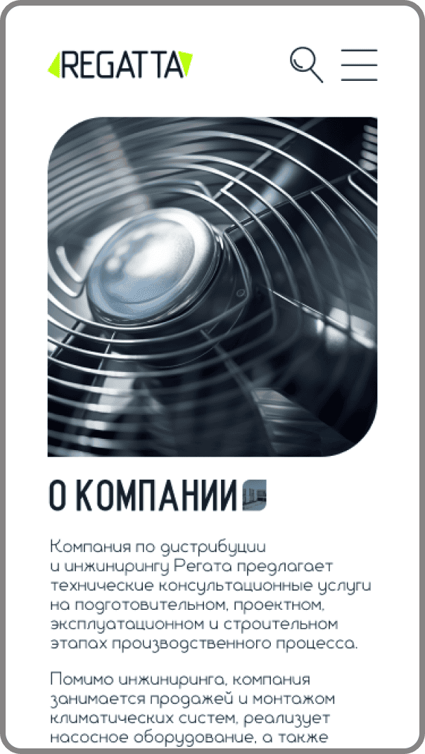
About the company page
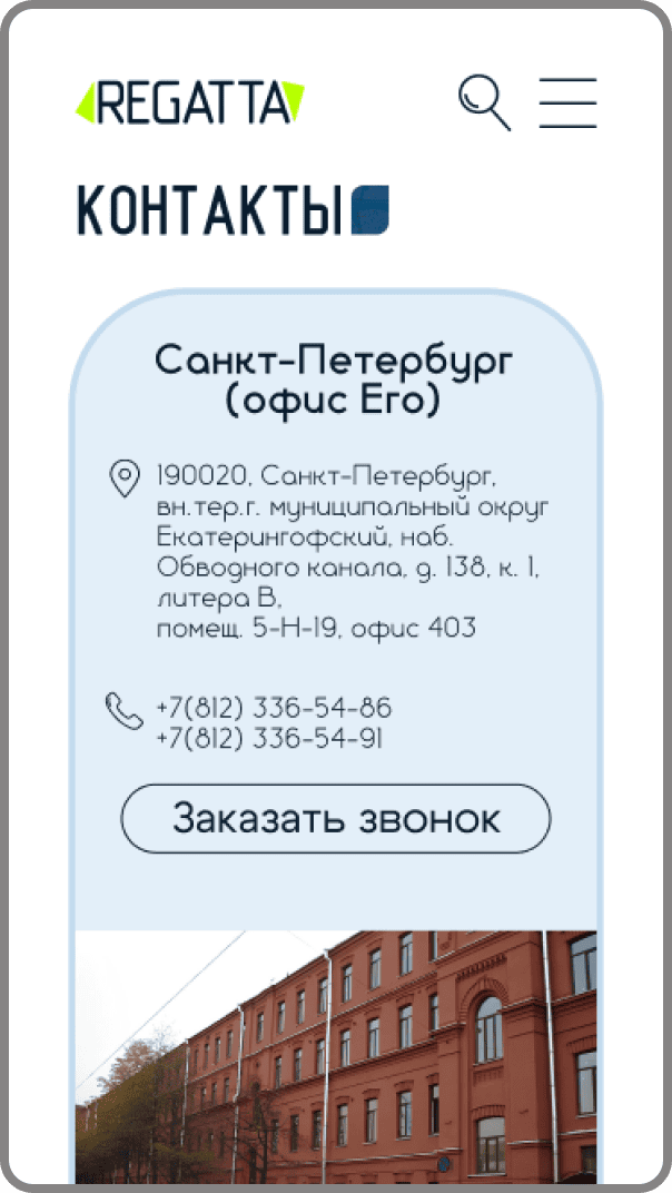
Contacts page

Partnership page
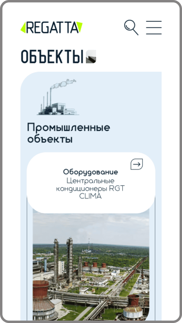
Sites section
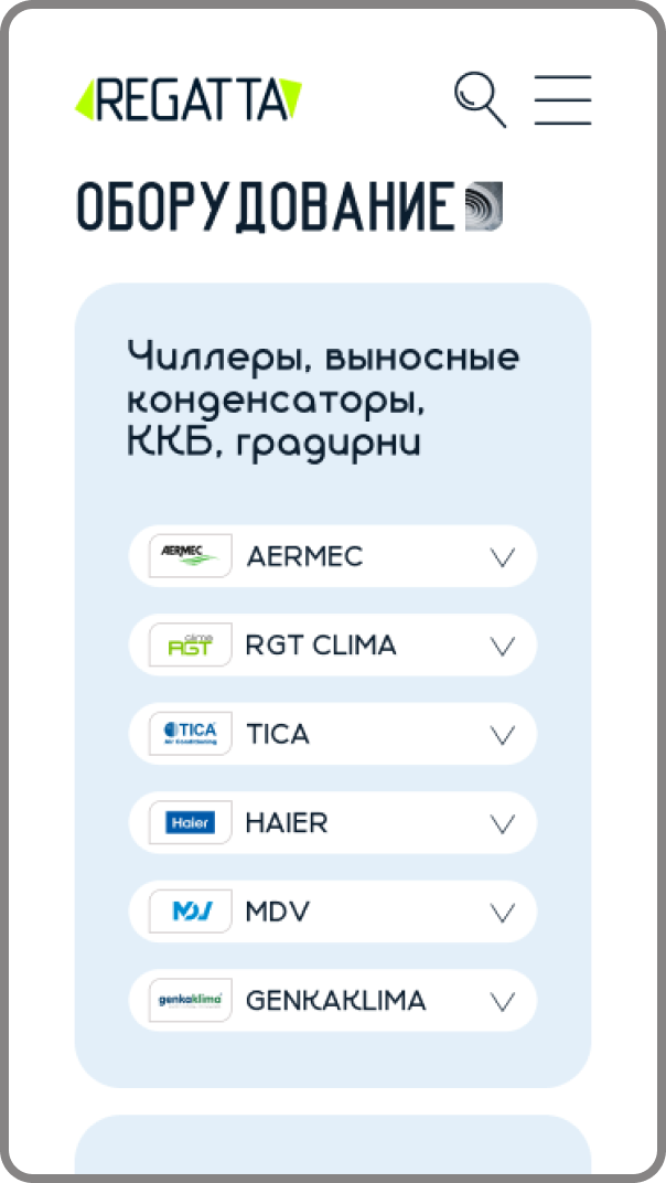
Equipment page
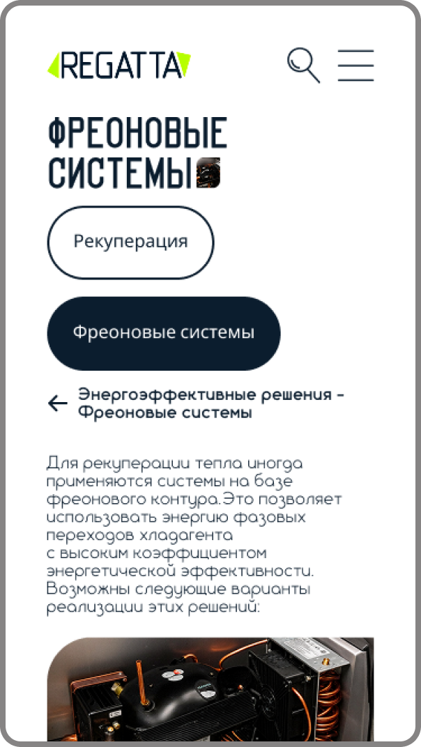
Article from the Industry solutions section

Industry solutions subsection
Summary
The project came out technical, careful and conversion-focused.
The team was able to:
Build clear navigation
Cut content publishing and update time to minutes
Build the infrastructure on a modern CMS
Raise load speed
Unify how every product section is presented

Task description / acceptance checklist
Main project acceptance criteria:
Correct work of every section: solutions, equipment, sites, blog
Correct filter behavior
Feedback form reliability
Responsive layout for key breakpoints
Valid HTML and no critical errors
Basic SEO readiness
Load speed not below the set threshold
Correct handover of all access and documentation